Calvin Campos's Wireframes
Desktop Wireframe

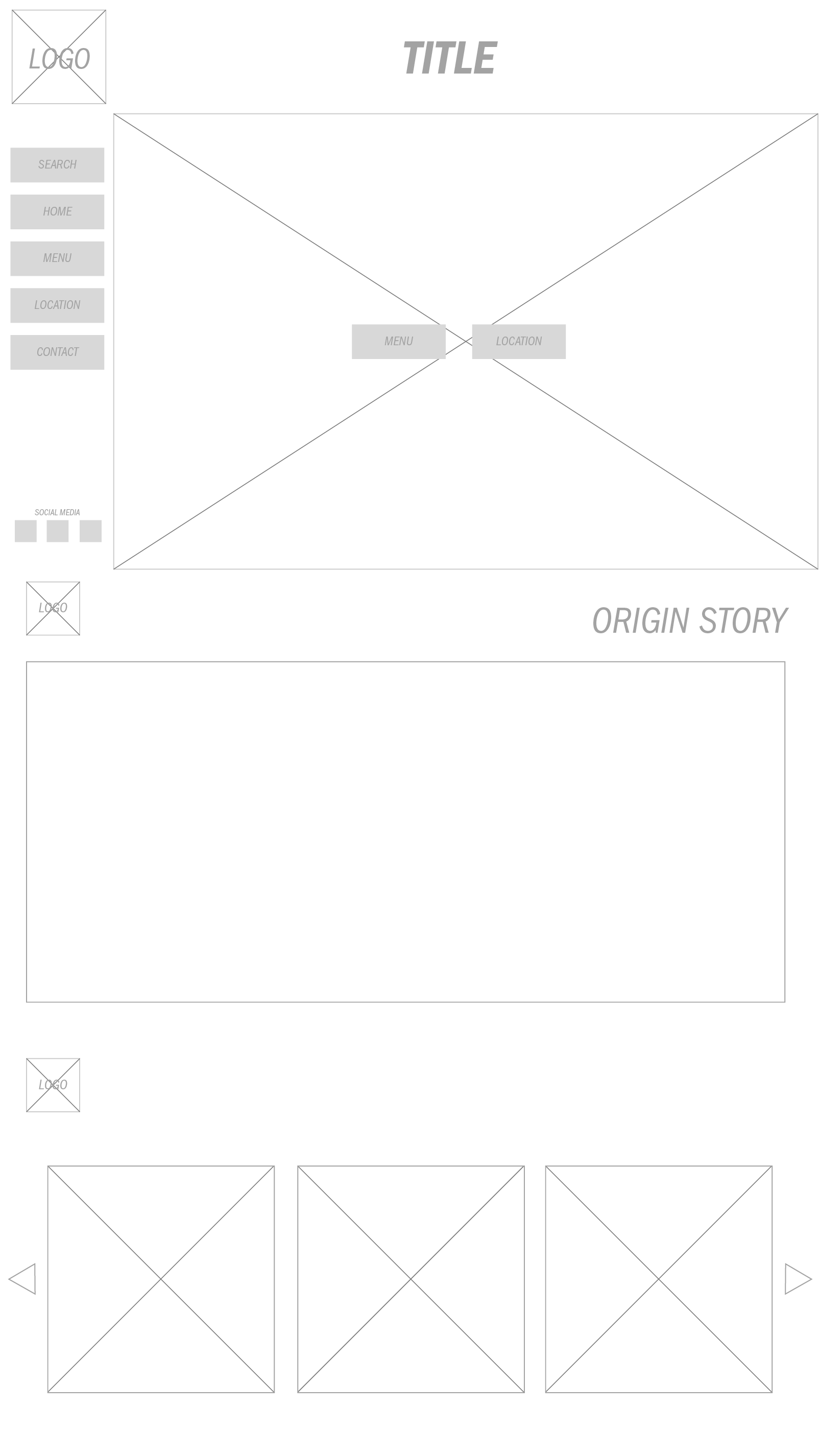
The first third of the wireframe is the sort of landing part of the site. It's the first page the viewer sees when they go to the link. When they scroll down, the 2nd third is what they see. The sidebar will vanish and the logo will become smaller at the top left corner. When they scroll one more time, they will find a slideshow showcasing different foods that the restaurant offers.
Mobile Wireframe

The only main two pieces to highlight for the mobile layout is the hamburger navigation bar at the top and the "back to top" button at the bottom.