Cal's Desktop VS. Mobile.
final task.
rationale:
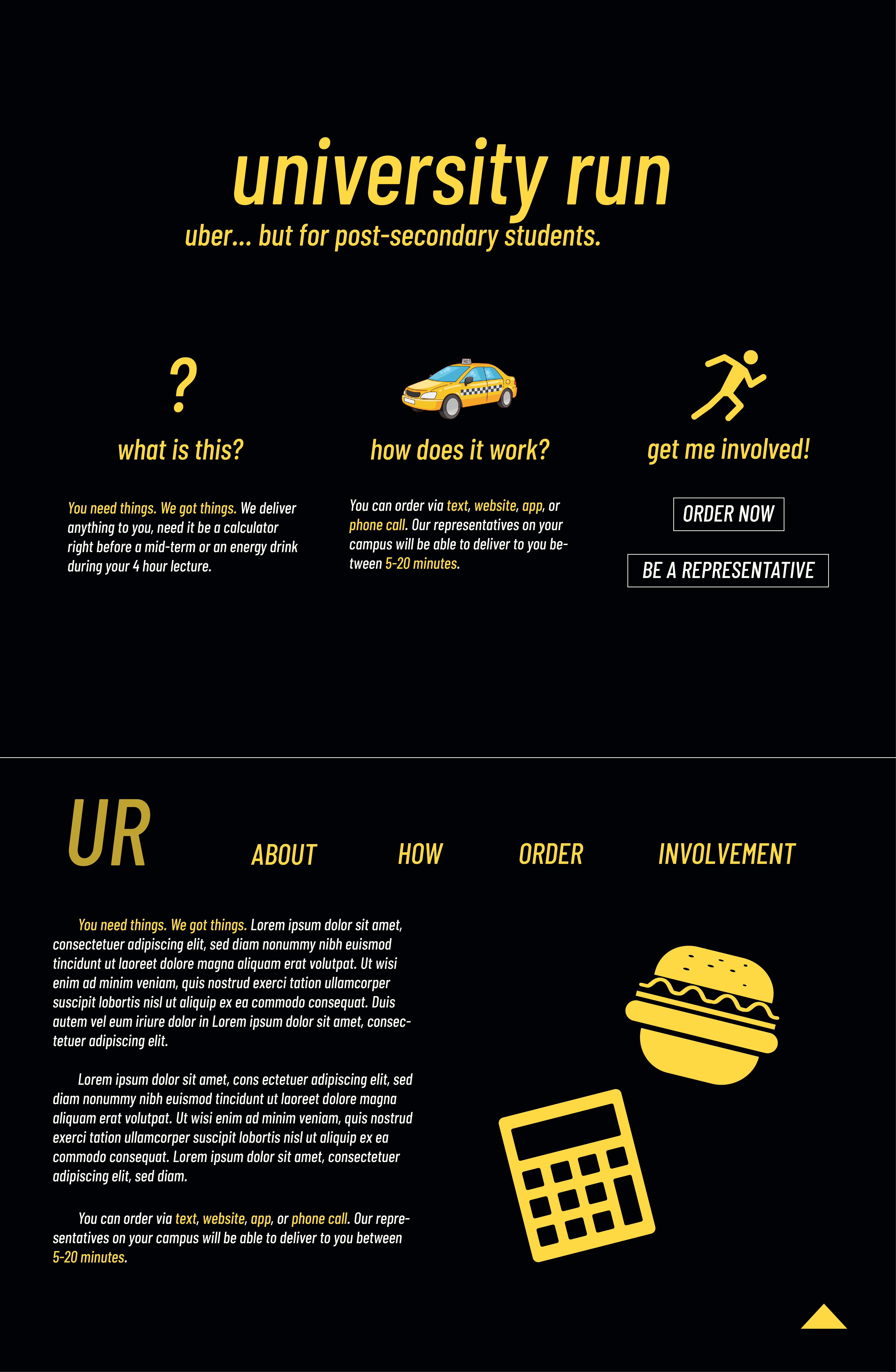
I made a desktop and mobile mock-up of a fictional business named "university run," which is essentially uber but for university students who
need something right on campus (a calculator, snacks, a pencil, etc.). I wanted a clean look, so I used a high contrast palette of black and
yellow. The yellow sort of resembles the colour of a school bus or taxi. The sans-serif typeface follows the minimalist and modern look of
the website. Finally, the graphics chosen also follow the minimalist theme and also help engage the viewer to flow through the website.
The mobile website's unique attributes are as follows: for returners, the simple one buton "order now" gets them to exactly where
they need to be and probably the main reason as to why they would be on the website. If the user scrolls down, they learn more about
UR and then are given the choice to get involved with UR. There is also a back-to-top button at the bottom.
Note: The desktop layout shows a landing page (the top half of the .png file) and then once scrolled down, the nav bar shows up and
long logo disappears, revealing the "UR" and nav.
Desktop

Mobile
